It's widely known that there is a gap in the mean income between men and women. This gap has been found to be the result of a complex series of factors, the specifics of which are not the focus of this peice. Rather, this document accepts the validity of the gener pay gap and examines the top 20 occupations from male and female contestants on the Bachelorette and the Bachelor to see if even a simple aggrigation of the Department of Labor's wage statistics and these occupations can illustrate this devide.
For this analysis, I used these databases:
- The Bachelor & Bechelorette Contestants Dataset on Kaggle
- The Bureau of Labor Statistics May 2019 national Occupational Employment and Wage Estimates
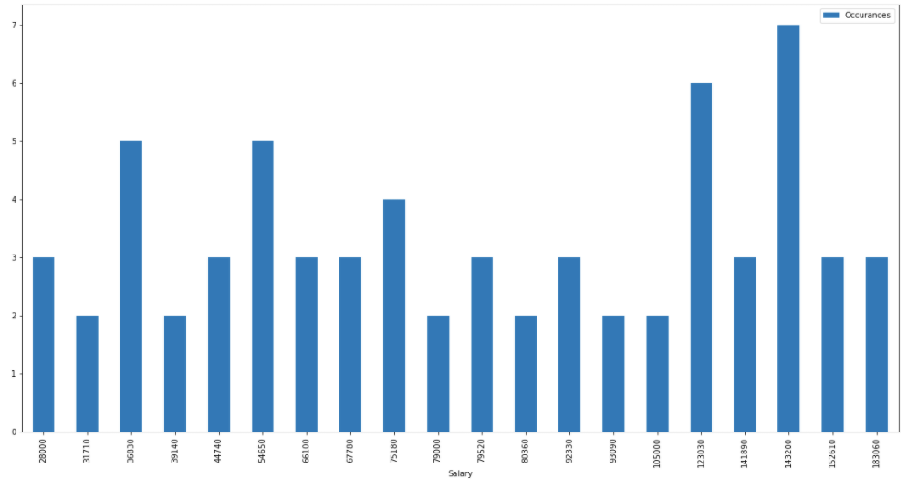
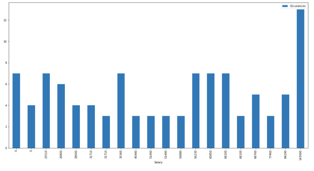
Using these databases I was able to aggrigate the occupational data of the contestants separated by gender. Then I isolated the top 20 occupations and used the BLS's database to match these occupations with their mean yearly income. From that point I was able to create these two visualizations where the annual mean salaries are compared to the number of contestants with said salary/occupation:
Male Contestants

Female Contestants

After this initial batch of visualizations I pulled the dataframes back into Excel for some simple analysis. After multiplying each salary by the number of contestants with said salary, every salary was added to a total along with the total contestants from the table. Then the salary total was devided by the number of participants to find an average salary for said gender. The results of this analysis were also telling:
- The average salary for the top 20 most common occupations among male contestants was: $89,748.33
- The average salary for the top 20 most common occupations among female contestants was: $56,662.98
- This created a difference of: 36.86%
With this data the message is clear, even the bachelor can't escape the systematic opressions of our current systems and in addition to this conclusion, the percent difference of this show's participants is worse then the aggriated paygap commonly sited in studies, the cause for which would have to be the product of more extensive analysis.